Metanor Resources
Case 06 · Mining & Resources · 2018
A gold company with strong leadership and high-grade intercepts, that looked like every other gold company. It was time for Metanor to present itself as the technology-forward player it already was.
Brief
Within the Québec mining sector, Metanor was well placed to stand out from the pack — strong, pragmatic leadership and a steady flow of high-grade intercepts.
None of that was showing up in how the company presented itself. In a sector where every deck and every booth looks the same, sounding like the pack is the same as being lost in it.


Approach
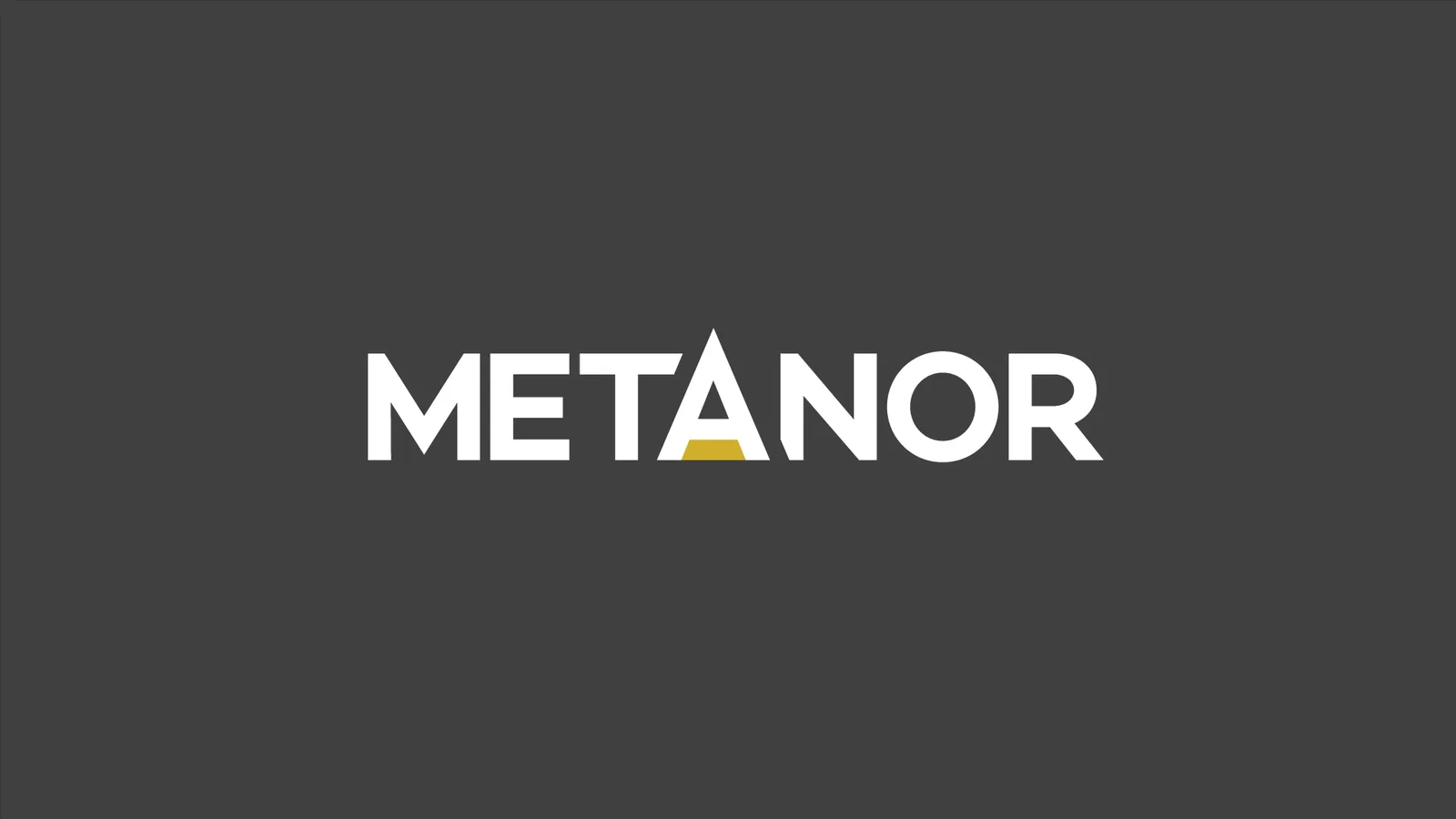
We took the letter A in Metanor and made it the focal point of the wordmark. It points north — Nord — and the negative space in the bottom half of the letter is a bar of gold. The whole company, in one character.
Then we removed something. Dropping “Resources” from the logo gave a cleaner mark, and one that reads identically in English and in French — which matters when your operations are in Québec and your investors are in Toronto.
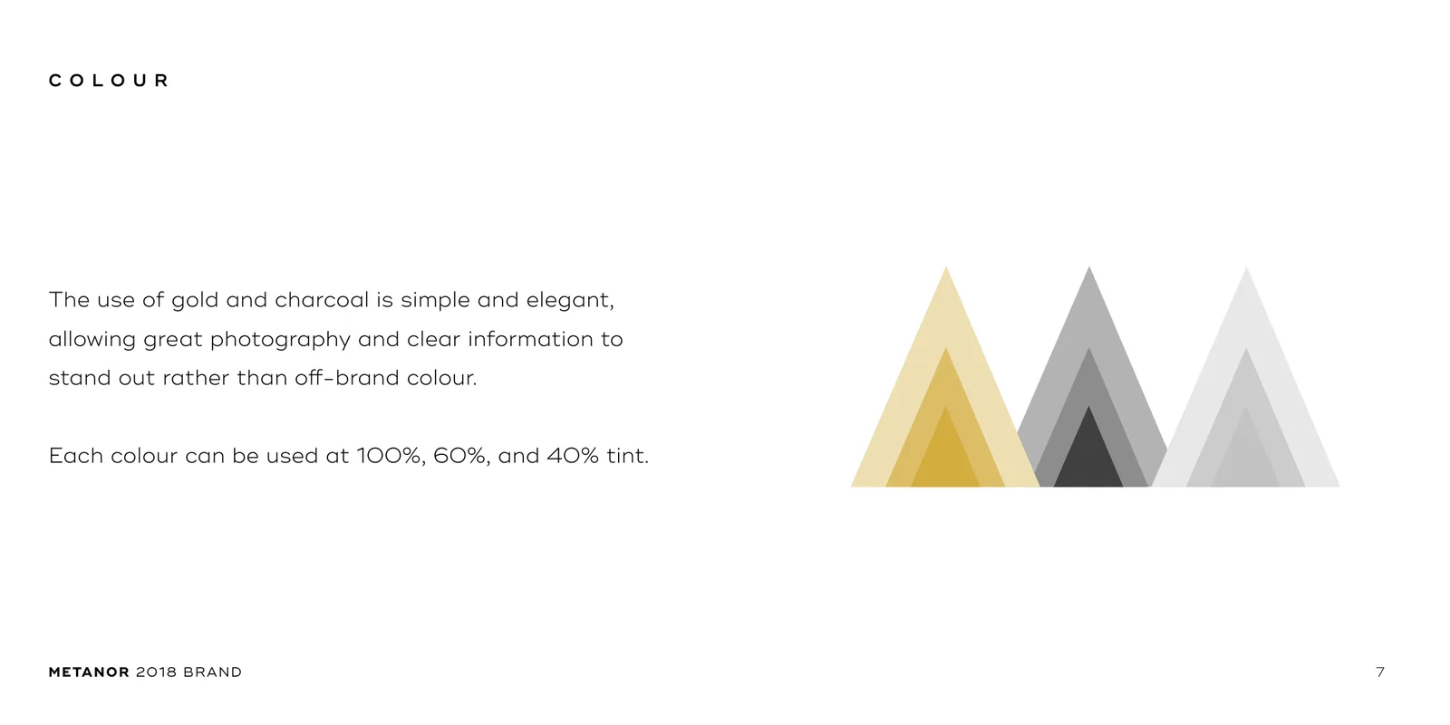
Gold and charcoal, each at 100%, 60% and 40% tint. A restrained palette lets good photography and clear numbers carry the page instead of competing with off-brand colour.
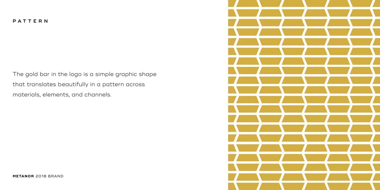
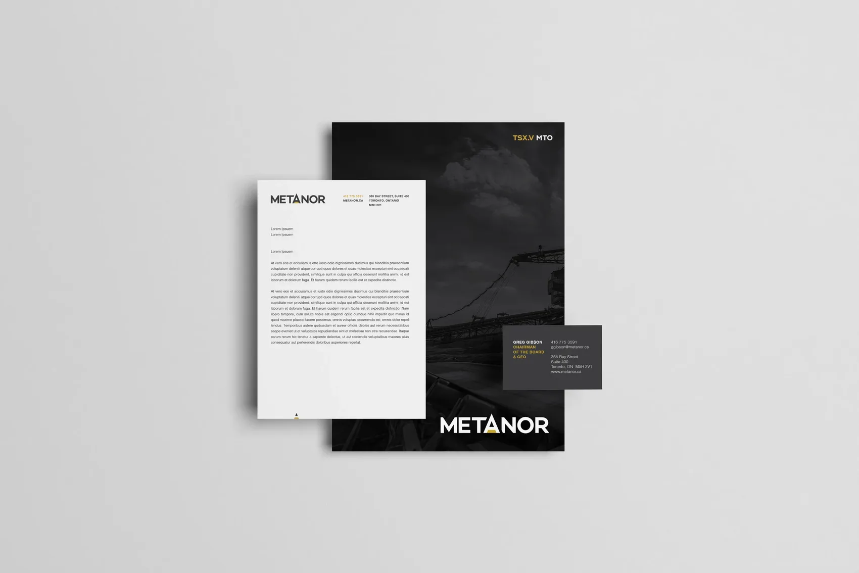
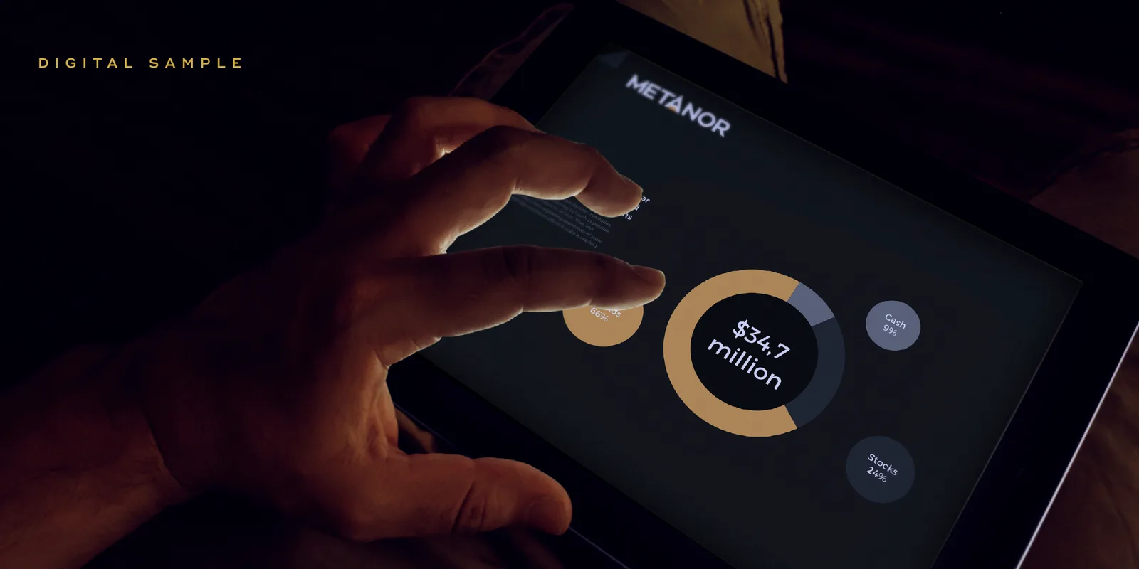
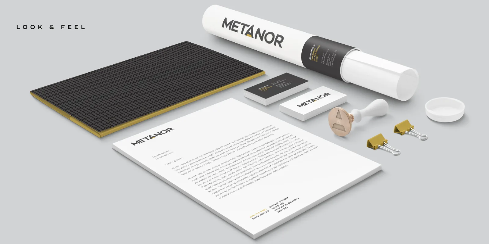
The gold bar became a pattern, so the identity could travel across a letterhead, a dashboard, a trade booth and a presentation without ever repeating the logo. Built as a system from the first day, not a logo with things bolted on afterwards.
Result
A brand that stands out among its peers by being quieter and more precise than they are — crisp, measured and technology-forward, which is what the company was already doing underground.
The identity went out into the world at PDAC — the mining industry's largest convention — on a street-side board reading “a new player has come to PDAC.” For a company whose whole problem was being indistinguishable from the pack, that is the sentence and the setting doing the same job.
We presented two concepts. The second one was captioned “in the event that you don't love concept one, which is impossible.” They took concept one.
This is how we'd approach yours.
Start a conversation →More work.
← All case studies