Satori
Case 03 · Travel Retail · 2018
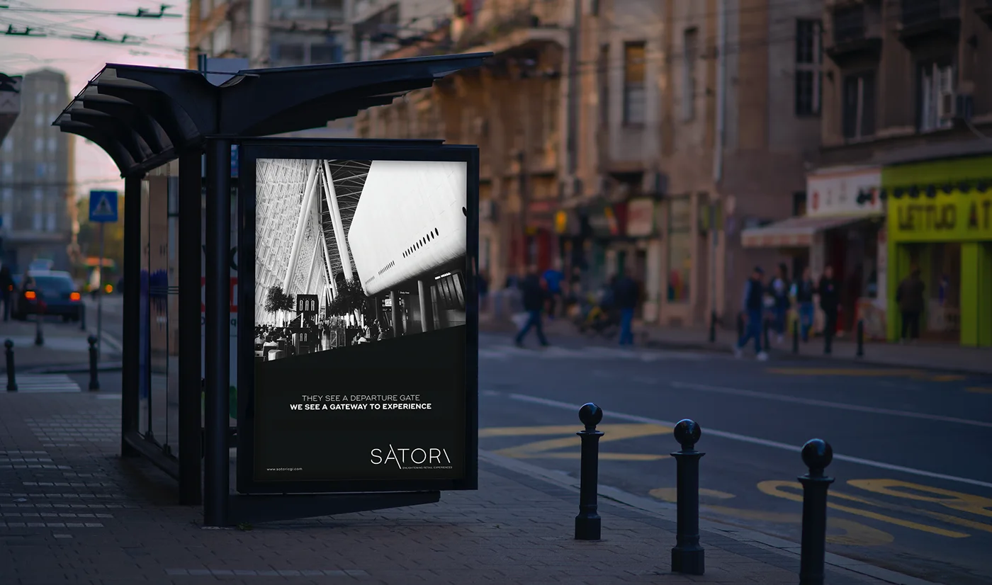
Satori sells the argument that an airport is not dead time. The brand had to make that case before anyone read a word of it.
Brief
Satori is a bespoke retail support agency launched in 2013 with the goal of changing the way consumers interact with brands in-store. Satori sees travel retail as a gateway to targeted, precise, and engaging brand experiences. The right blend of strategic thinking, curiosity and experience gives them the insight to make powerful connections between consumers and a brand–at every stop on their travel journey.

Approach
The Language of Precision.
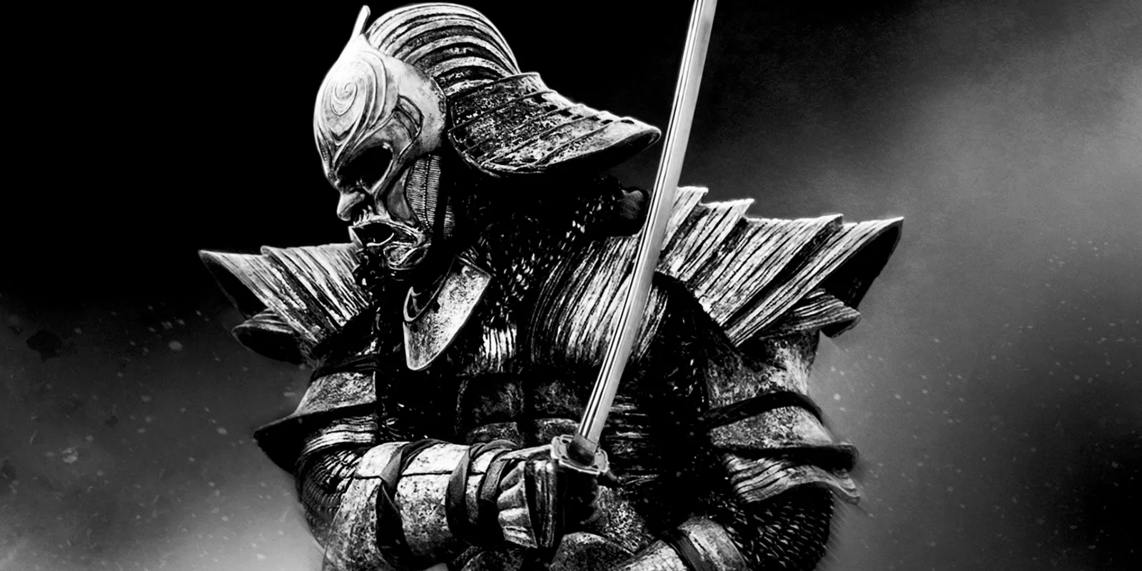
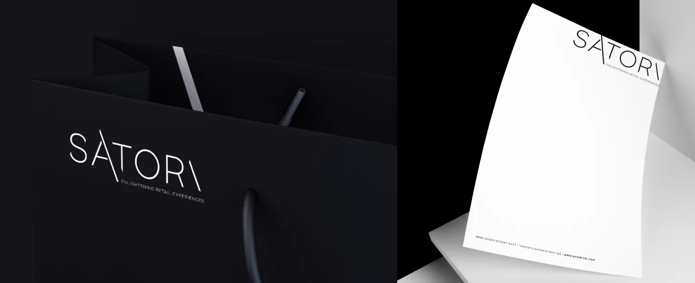
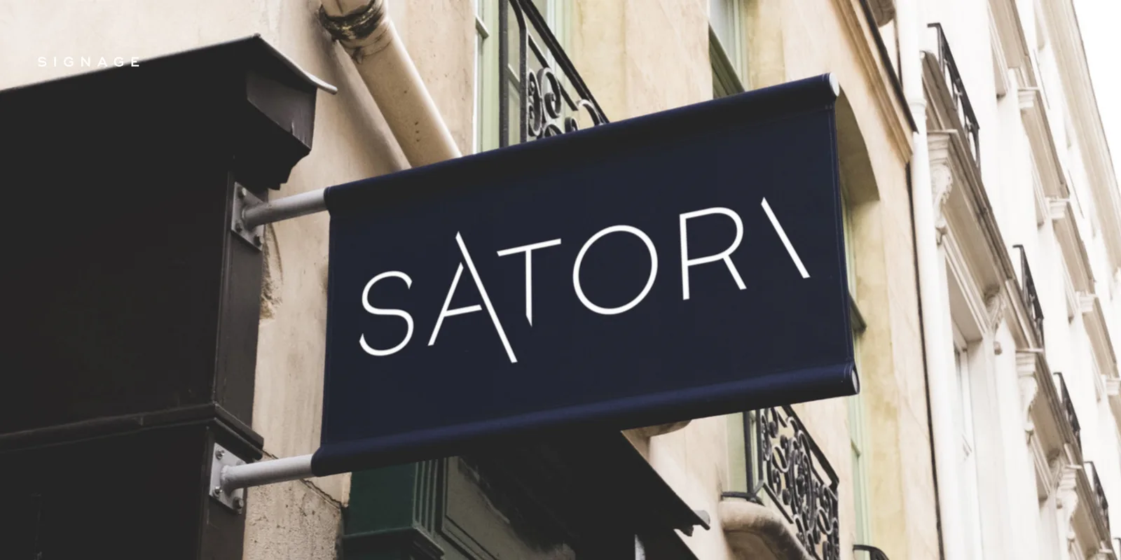
Inspired by the traditional Japanese Katana, we created an identity that represents transcendence and luxury in today’s fast-paced retail industry. We have developed a fully customized typeface that cuts, marks, and moves with every turn. It’s modern and stylish, with a nod to Japanese precision and craftsmanship.
Result
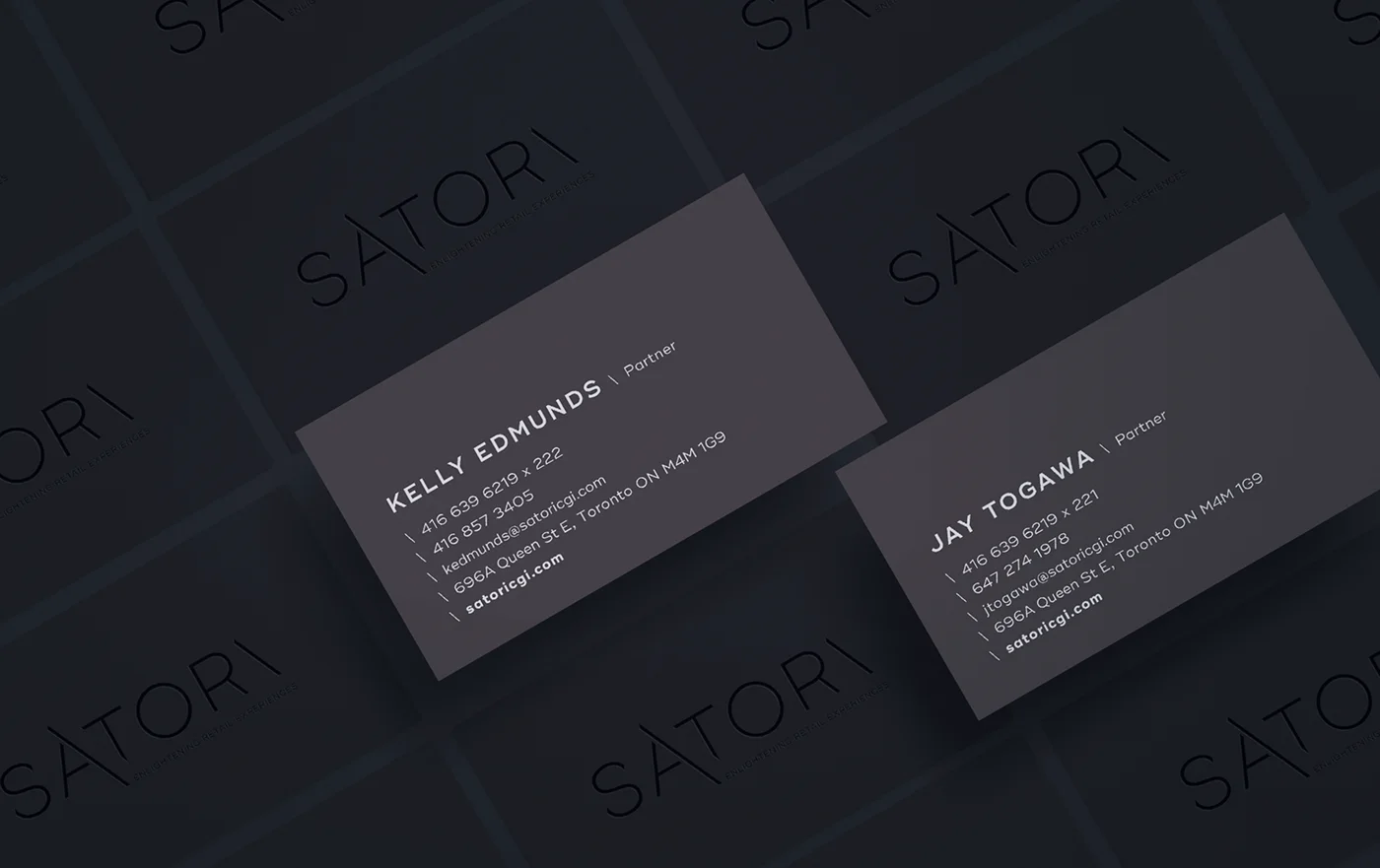
An identity that holds at both ends: a blade sign read from across the street, and 8pt type on a partner's co-branded lockup.
Print, packaging, out-of-home, signage, and a presentation template built so two partners could pitch without calling a designer — which, for an agency that lives in pitches, was the deliverable that got used the most.
We built the website too. It is still running.
This is how we'd approach yours.
Start a conversation →More work.
← All case studies